Marketing
How to Use Landing Page Generator to Improve SaaS Signup Conversions
Waveon Team
12/12/2025
0 min read

If you are trying to figure out how to use a landing page generator to improve SaaS signup conversions, the goal is not just to spin up pages faster. You want a repeatable way to turn more visitors into trial users, freemium signups, or demo requests without needing a developer every time. That means setting up your generator, your page structure, and your integrations so every new page you publish is built around a single, measurable signup outcome.
Recent data shows the average landing page conversion rate sits around 6.6% across industries as of Q4 2024, according to Unbounce. Many SaaS teams see even lower numbers, with nearly two out of three marketers saying their landing page conversion rate is under 10% (HubSpot State of Marketing). The good news is that with the right setup and ongoing testing, SaaS companies regularly see 30–70% lifts from focused landing page optimization, as documented in multiple case studies on Unbounce and CXL.
If you are building or updating your SaaS marketing stack, you may also want to explore how an AI website builder or no-code landing page generator can speed up experimentation while keeping your pages consistent. The rest of this guide walks through a practical workflow you can copy: from configuring your landing page generator around one signup goal, to running A/B tests and building an always-on optimization routine.
Quick Step-by-Step Checklist
If you want a simple checklist to follow as you work through this guide, you can use these steps as your “how-to” plan. Each step connects directly to the sections that follow and gives you an at-a-glance view of the work involved. If you already have some pieces in place, you can skip ahead to the sections that map to the gaps in your current setup.
Here is a concise checklist you can keep open as you optimize your SaaS signup flow:
| Step | What to Do | Why It Matters for SaaS Signup Conversions |
|---|---|---|
| 1 | Define one primary signup goal per landing page (free trial, freemium signup, or demo request). | A single, clear goal keeps your message focused and your data clean. |
| 2 | Choose a SaaS-focused landing page template with a strong hero and visible CTA. | Templates designed for software make it easier to show value quickly. |
| 3 | Configure domains, SSL, and global tracking pixels before launching campaigns. | Clean tracking and a secure domain boost trust and data quality. |
| 4 | Structure the hero section around a benefit-focused headline and one main CTA. | Most visitors decide in a few seconds whether to stay or leave. |
| 5 | Add social proof, FAQs, and simple pricing or “what you get” content. | Addressing doubts upfront helps more visitors commit to signup. |
| 6 | Connect forms to your CRM, product backend, and email tool. | Every signup should instantly become a trackable lead or user. |
| 7 | Trigger onboarding or follow-up email sequences automatically after signup. | Fast, relevant follow-up increases activation and trial usage. |
| 8 | Run A/B tests on headlines, visuals, CTA copy, and form length. | Controlled experiments show what actually improves conversions. |
| 9 | Use analytics to spot drop-off points and prioritize fixes. | Data reveals where people hesitate or abandon the page. |
| 10 | Review and refresh your highest-traffic pages on a regular cadence. | Ongoing updates keep pages aligned with your product and market. |
As you go through the rest of the article, you can come back to this checklist and tick off items as you implement them in your own landing page generator. Treat it as a living document that you refine as you learn what works for your specific SaaS audience.
Set Up Your Landing Page Generator Around a Single SaaS Signup Goal
Most landing pages underperform because they try to do too many things at once. Before you even touch templates or colors, you need to decide exactly what success means for this page. When you are thinking about how to use a landing page generator to improve SaaS signup conversions, the first step is to define one primary conversion event and build everything else around it.
For a SaaS product, that primary goal is usually one of three things: start a free trial, create a freemium account, or request a demo. Each of these has different expectations around friction. A “start free trial” page might justify asking for a work email and company size, while a “request a demo” page can often ask for a bit more information because the perceived value is higher. What you want to avoid is mixing goals on the same page. If you ask visitors to “Start free trial,” “Book a demo,” and “Join newsletter” all at once, your data becomes muddy and your message gets diluted. Pick the one action that most closely ties to revenue and design the entire page around it.
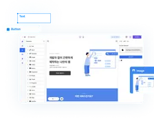
Once you know your main signup goal, you can choose templates in your generator that are actually designed for SaaS, rather than generic lead capture. Many tools now provide “SaaS product,” “software trial,” or “B2B app” layouts that put a prominent hero section, a clear call to action, and a product visual front and center. These templates usually give more space to benefit-driven copy and screenshots, and less to blog links or unrelated content. When browsing options, look for templates where the signup form or main CTA is visible above the fold and there is a natural flow down the page from value proposition to proof to pricing. This saves you from wrestling with layouts better suited to ebooks or simple contact forms.
After template selection, it is worth spending a few extra minutes on the unglamorous but critical settings in your landing page generator. Assign the correct domain or subdomain so your SaaS brand is consistent and visitors recognize they are in the right place. Enable SSL so your pages load over HTTPS; this is table stakes for trust and can impact both conversions and SEO. Add your tracking pixels and analytics tags—Google Analytics, Meta pixel, LinkedIn Insight Tag, or any product analytics script you use—at the global level, so every generated page automatically collects reliable data. When your basic configuration is clean, you can launch new pages confidently and compare conversion rates between campaigns without wondering if the numbers are off.
If you are already using an AI-powered builder such as Waveon’s AI landing page generator, this is also the stage where you can define your default styles, brand colors, typography, and reusable components. Doing that once helps every new experiment start from an on-brand, conversion-ready baseline instead of a generic template. Over time, having this foundation in your landing page generator is one of the easiest ways to improve SaaS signup conversions without reinventing your design system for every new campaign.
Structure Your SaaS Landing Pages for Clear Value and Fewer Distractions
Once your generator is set up, the way you structure each page has more impact on conversions than any single design tweak. Visitors should be able to glance at the top of the page and instantly understand what your product does, who it is for, and what they should do next. This is especially important when you are learning how to use a landing page generator to improve SaaS signup conversions at scale, because you want a structure that can be reused with small variations across many campaigns.
Above the fold, keep things simple. Most high-performing SaaS pages use one main call to action and a short form or button in the hero section. For a free trial, a headline like “Spend less time on X, get Y done in minutes” paired with a brief subheading and a single “Start free 14-day trial” button is often enough. If your generator allows, embed a compact form directly in the hero for top-of-funnel offers, asking only for email and maybe first name. The goal is to remove friction: fewer form fields, no cluttered secondary buttons, and no confusing layout that makes the signup action hard to find. Every extra choice increases the chance of abandonment, which directly lowers your signup conversion rate.
Your unique value proposition should be the hero of the page. Use the headline and subheading to clearly state the core outcome your product delivers, not just what it is. For example, “Automated expense reporting for remote teams” is clearer and more compelling than “Modern finance platform.” Many landing page builders let you pair this copy with a product visual block. Use that to show an actual screenshot of your dashboard, a short looping animation of the key workflow, or a simple illustration that hints at the interface. Concrete visuals help visitors connect the promise in your headline with what they will actually see after signup, which makes the conversion feel less risky.
Navigation is another quiet killer of conversions. On campaign-focused landing pages, you generally do not need a full top navigation bar linking to blog, careers, and documentation. If your builder lets you, strip navigation down to a logo and perhaps a small “Login” link for existing users. The main scroll should keep people focused on understanding the product and signing up, not wandering off to other parts of your site. Likewise, be intentional with section count. It is better to have a concise page that moves from headline to benefits to proof to pricing than a long sprawl of unrelated content that dilutes your message. The beauty of a generator is that you can save a focused layout as a reusable pattern and avoid overstuffing every new page.
If you are using a broader no-code stack to build multiple assets, consider aligning your landing page structure with your main SaaS website messaging. Consistent language around your core benefits and audience helps visitors feel they are in the right place, whether they arrive on a campaign-specific page or your homepage. This consistency also simplifies optimization, because improvements in one place can often be cloned and adapted elsewhere.
Add Trust, Social Proof, and Product Clarity to Support Signups
Even the cleanest layout will not convert if visitors are not convinced your product works for people like them. This is where built-in blocks in your landing page generator—testimonials, logos, FAQs, pricing tables—become powerful. They allow you to answer the unspoken “Will this really help me?” and “What might go wrong?” questions directly on the page, which is critical if you want to improve SaaS signup conversions instead of just clicks.
Start with social proof. Many generators offer dedicated testimonial and logo sections that you can drag into your layout. Populate these with quotes from real customers that speak to tangible outcomes: time saved, revenue gained, errors reduced, or specific workflows you have made easier. If you are serving a specific niche, try to include quotes from that segment; a CFO at a SaaS company will trust another CFO’s words more than a generic “Great product!” remark. Logo rows of recognizable customers, even if they are mid-market rather than big-name enterprises, add another layer of credibility. When relevant, rating badges from platforms like G2 or Capterra can also be added using image or embed widgets so visitors see third-party validation, not just your own claims.
Next, use FAQ and pricing sections to handle objections before they turn into drop-offs. Research from various SaaS benchmarks suggests that free trial to paid conversion rates often fall in the 15–25% range depending on segment and onboarding quality (Powered by Search), which highlights how many people stop short after creating an account. By answering questions about commitment (“Can I cancel anytime?”), data security (“Where is my data stored?”), and features (“Does the trial include all features?”) right on the landing page, you reduce the friction that stops visitors from starting that trial in the first place. A clear pricing block, even if it is a high-level overview that links to your full pricing page, reassures people that there are no hidden surprises and that pricing will not be a bait-and-switch.
Finally, make the product itself easy to grasp. Use screenshot galleries, short product tours, or embedded videos to show a slice of the user experience. Many landing page tools now offer video blocks and image carousels you can quickly plug in. Focus on the “aha” moments that are closest to your signup goal: if your promise is “Create project reports in 2 minutes,” show how a report is created in a few steps from inside the app. Some teams also embed interactive demos or sandbox environments directly from third-party tools, letting visitors click around without creating an account. The more clearly visitors can picture themselves using your software, the more confident they feel about handing over their email and starting a trial or booking a demo.
When you combine these trust elements with a clear structure and a focused CTA, your landing page generator stops producing pretty but shallow pages and starts generating assets that actually move SaaS signup conversion numbers in the right direction.
Connect Forms, CRM, and Email Tools for a Smooth Signup Flow
A polished landing page is only as good as the funnel it feeds into. If form submissions land in someone’s inbox instead of your CRM, or if there is a delay before new signups receive onboarding emails, you will lose momentum and likely see lower activation and paid conversion. When you are thinking about how to use a landing page generator to improve SaaS signup conversions, you should treat integrations as part of conversion optimization, not just a backend chore.
Most modern landing page generators integrate directly with popular CRMs and marketing automation tools. Where possible, use native integrations instead of custom scripts, because they tend to be more reliable and easier to maintain over time. Configure your forms so that every new signup is pushed in real time into your CRM or user database, tagged with the correct campaign, source, and page. If your product uses a separate user table, consider using webhooks or middleware tools like Zapier or Make to bridge the gap between the landing page form and your application backend. The goal is for a visitor to fill out the form and immediately exist as a contact or user in your system without manual copy-paste work or delays.

Once the signup data is flowing, connect your email platform so that signups automatically trigger tailored sequences. For free trials, that usually means a welcome email, a quick-start guide, and a series of short, focused messages that highlight one key action at a time inside the product. For demo requests, the sequence might include a confirmation, a calendar booking link, and reminder emails leading up to the call. Many teams underestimate how much this matters: if someone signs up and hears nothing for hours, the perceived professionalism drops and their initial intent fades. A tight connection between your generator and email tool ensures every new signup receives timely, relevant communication, which is one of the most reliable ways to improve SaaS signup conversions downstream.
Form length is another critical lever. MetricHQ notes that sign-up conversion rate is simply the percentage of visitors who complete your signup action (MetricHQ), and every additional field tends to chip away at that percentage. As a rule of thumb, collect only what you truly need to deliver value in your first interaction. If your onboarding does not meaningfully use “phone number” or “job title,” consider leaving them out. You can always ask for additional details later, either in-app or via progressive profiling in emails. One practical approach is to create two form variants in your generator: a “minimal friction” version for cold traffic campaigns and a “richer data” version for warmer audiences like retargeting or existing subscribers.
If you are using a no-code platform such as Waveon’s vite coding environment, you can often centralize these integrations once and reuse them across landing pages, your main marketing site, and microsites. That means you do not have to rebuild connections every time you launch a new experiment. Instead, your landing page generator becomes the front door to a consistent, well-instrumented signup funnel, and every improvement you make at the integration level helps improve SaaS signup conversions across your entire marketing stack.
Use A/B Testing and Analytics to Improve SaaS Signup Conversion Rates
Once your pages and integrations are live, the real work begins. The fastest way to learn how to use a landing page generator to improve SaaS signup conversions is to run structured experiments and read your analytics with a specific question in mind: “What is stopping more visitors from signing up, and how can I test a better version?” Without this feedback loop, you end up debating opinions instead of following the data.
Many landing page tools now ship with built-in A/B testing. Start with simple tests on high-impact elements in the hero section, such as headlines, main visuals, and primary CTAs. For example, you might test a benefit-focused headline against a more descriptive one, or a product screenshot versus an illustration or customer photo. Keep each test focused on one main change so you can attribute results clearly. Also, make sure to run tests long enough to reach a reasonable level of traffic and statistical confidence; stopping after a day because one version “looks better” is a quick way to chase noise and make decisions based on randomness.

Your analytics should guide where you test next. At a basic level, track page views, click-through rates on your primary CTA, and form submission rates. If your generator supports scroll depth or section-level tracking, use that to see where people drop off. For instance, if many visitors see your hero but few scroll to your social proof block, then optimizing the hero copy and form placement will likely have more impact than rewriting testimonials. Similarly, if clicks on the CTA are strong but form submissions are low, the problem may be form friction or post-click experience rather than the page messaging itself. Combining qualitative feedback from tools like session recordings or on-page surveys with quantitative data often gives you a clearer picture of what to test.
One often overlooked part of optimization is documentation. When a test produces a clear winner, do not just flip the switch and move on. Record what you tested, the hypothesis, the traffic and timeframe, and the final numbers. Over time this builds your own internal playbook of what works for your audience. Case study collections like Unbounce’s landing page optimization examples and CXL’s conversion case studies show that companies repeatedly gaining 50%+ lifts are not relying on one miracle variant; they run a steady stream of small, well-documented experiments and compound the results. Treat your landing page generator as the testing ground where those experiments are easy to set up and roll out.
If you are just getting started with experimentation, pairing your landing page generator with beginner-friendly resources on conversion rate optimization can help you prioritize what to test first instead of guessing. Focus on the areas of the page that most directly support your SaaS signup goal and work outward from there.
Create an Ongoing Optimization Routine for Your SaaS Signup Pages
Landing pages are not “set and forget” assets, especially for SaaS products that evolve quickly. Features change, pricing shifts, and your ideal customer profile can move upmarket or downmarket. To keep your signup rates healthy, you need a light but consistent routine that keeps pages aligned with reality and with your users’ expectations, rather than relying on a design you created a year ago.
A practical starting point is to schedule regular reviews of your core signup pages—at least once a quarter, and more often if your product is changing rapidly or if you are investing heavily in paid acquisition. Use these sessions to update headlines to reflect your current positioning, swap in newer screenshots that match the latest UI, and adjust copy based on the objections you are hearing in sales calls or support tickets. For example, if prospects keep asking whether you integrate with a specific tool, that is a signal to highlight that integration on the landing page instead of burying it in documentation. Your landing page generator makes these updates fast, so the main challenge is remembering to do them consistently.

Performance is another part of the routine that is easy to ignore until it hurts. Slow pages lose visitors; even small delays can reduce conversions. Many builders provide basic page speed indications or integrate with tools like Lighthouse. Use these to check load time on both desktop and mobile. Large, uncompressed images, heavyweight videos, and unnecessary tracking scripts are common culprits. Compress images, use modern formats like WebP where supported, and consider hosting longer videos externally and embedding them rather than uploading huge files directly. With mobile traffic often representing half or more of visitors, always preview and test your pages on several screen sizes inside the builder to ensure forms, buttons, and text are still easy to use on smaller screens.
Finally, use your landing page generator’s cloning features to turn what works into a scalable asset. When you find a layout and structure that reliably converts—for example, a particular hero plus social proof plus FAQ sequence that consistently hits 10–15% signup rate—save it as a template inside the tool. The next time you run a new campaign for a different audience or feature, start from that winning template rather than a blank canvas. This not only speeds up launches, it also keeps your experiments grounded in proven patterns instead of reinventing the wheel each time. Over time, this habit is one of the most efficient ways to improve SaaS signup conversions across multiple segments and channels without adding design or development overhead.
Bringing It All Together
When you zoom out, improving SaaS signup conversions with a landing page generator comes down to building a simple but disciplined system. You define one clear signup outcome for each page, pick SaaS-appropriate templates, and set up domains, SSL, and tracking once so every new page starts on solid ground. You structure your pages so the value is obvious, the primary CTA is hard to miss, and distractions like heavy navigation and competing offers are minimized.
From there, you layer in the elements that help visitors feel comfortable saying yes. You use testimonials, logos, FAQs, and pricing summaries to answer the doubts people usually keep to themselves. You show real product screens or short demos so prospects can picture themselves using your app, instead of asking them to trust a vague promise. Behind the scenes, you connect forms to your CRM, product, and email tool so every signup lands in the right place and triggers a timely, relevant follow-up rather than disappearing into a spreadsheet or inbox.
Once that foundation is in place, you shift into an experimentation mindset. You use A/B tests to learn what kind of headline, visual, or form length actually moves your signup rate, and you let analytics highlight where people are dropping off. When you find a winner, you document it and turn it into a reusable template, then clone and adapt it for new campaigns instead of starting from scratch. Along the way, you review your key pages on a regular cadence, update copy and screenshots as your product evolves, and keep page speed and mobile usability from sliding.
If you are wondering what to do next, pick one high-traffic signup page and treat it as your pilot project. Clarify a single goal for that page, simplify the hero section around one CTA, and add or update at least one block of social proof or FAQs. Then connect the form cleanly to your CRM and email tool if it is not already, and set up a basic A/B test on the headline or CTA. Give the experiment a couple of weeks to run, and watch what happens to your signup rate.
Once you see a meaningful lift on that first page, use your landing page generator—or an AI website builder & landing page platform—to roll that winning structure out to your other core funnels: different segments, ad groups, or feature-specific campaigns. Treat each new page as another chance to apply the same workflow: one goal, clear structure, strong trust signals, tight integrations, and small, ongoing tests. Over time, those modest improvements compound into a much healthier pipeline of trials, freemium accounts, and demo requests, without needing to hire more developers or rebuild your site from the ground up.
Learn more about No-code insights
Subscribe Waveon Newsletter
*Type your email address