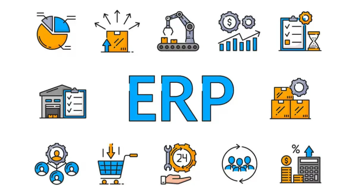
ERP Implementation Readiness Checklist
Learn what SMBs should fix before ERP implementation, including item data, workflows, inventory, purchasing, and settlement processes.
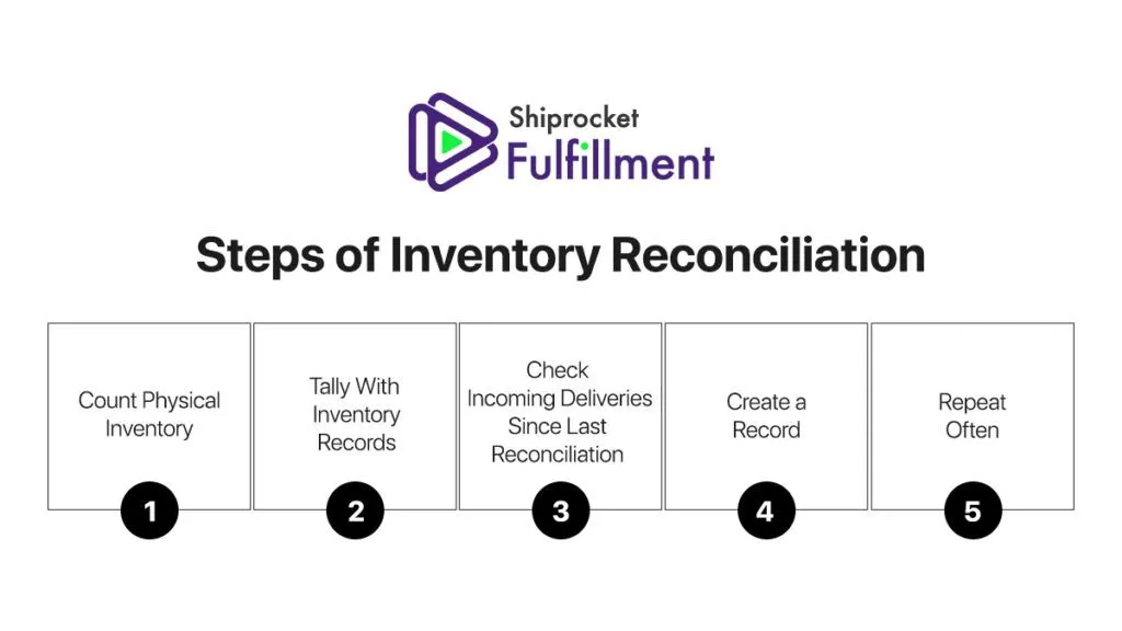
Inventory Reconciliation Process: Practical Guide
Learn how inventory reconciliation finds stock mismatches, why discrepancies happen, and how to fix the process before losses grow.

Purchase Order Approval Workflow Guide
Learn how purchase order approval workflows reduce delays, control spend, and improve purchasing visibility as order volume grows.
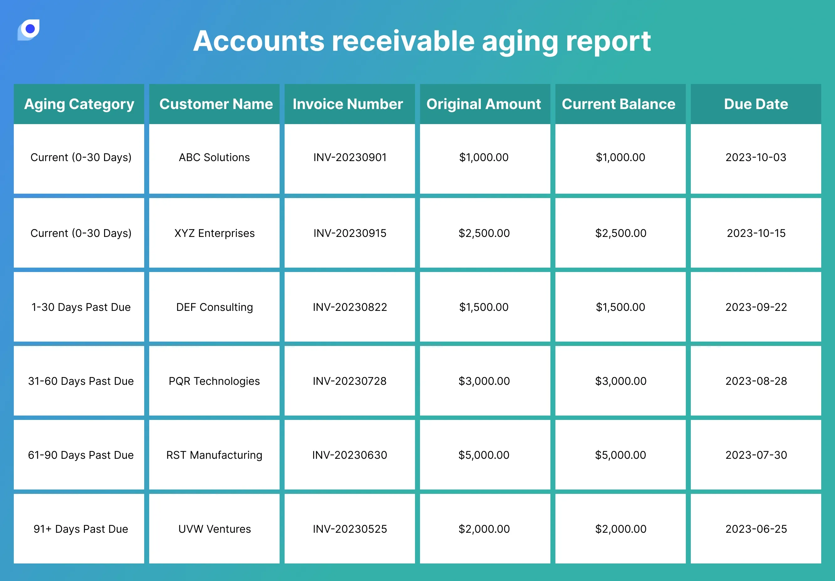
Accounts Receivable Aging Report: What It Shows
Learn how AR aging reports reveal overdue invoices, cash flow risk, and payment patterns, and when to standardize collections beyond spreadsheets.
.png)
Bubble.io Review: Features, Pricing, Pros and Cons
Read a Bubble.io review covering features, pricing, use cases, and limits. Decide if Bubble is the right no-code tool for you.

Startup KPIs & Growth Metrics Guide: Measuring What Matters
Learn which KPIs and growth metrics matter for startups. Covers North Star Metric, MRR, churn, milestones, and common measurement mistakes.
The Complete Startup Guide: From Idea to Growth
A practical startup guide covering lean methodology, MVP validation, growth metrics, and KPIs. Learn the two pillars every founder needs.

AI & No-Code Website Builder Guide: Platforms, Tools, and Startup Use Cases
A practical guide to AI website builders, no-code platforms, and startup website tools. Compare approaches for ecommerce, B2B, and MVP launches.

AI Landing Pages & Website Builders: A Complete Guide
Compare AI landing page tools and no-code website builders. Find the right approach for campaigns, brand sites, and startup launches.

What Is Inventory Turnover? Formula and Benchmarks
Learn how to calculate inventory turnover, compare benchmarks, and improve stock performance through better purchasing and reorder workflows.

FIFO vs LIFO: Inventory Valuation Guide
Compare FIFO and LIFO inventory methods, how they affect cost and cash flow, and why accurate stock movement tracking matters.

Marketing Strategy & Growth Guide: Psychology, SEO, and Product Launch
A practical guide to marketing strategy covering consumer psychology, personalization, SEO, product launch, and emerging channels like video and chatbots.

Digital Marketing Strategy & Automation: A Complete Guide for SMBs
A comprehensive guide to digital marketing strategy and automation for small businesses. Covers marketing automation, content marketing with AI, and growth strategy.

Inventory, ERP, and Operations Guide
Learn how inventory, ERP, order management, and BOM workflows fit together, and where small businesses should start improving operations.

What Is Cost Accounting? SMB Guide
Learn what cost accounting is, key cost types to track, and how to connect cost data to pricing, orders, and settlement.
AI Business System Builder