Marketing
Startup Website Builder Checklist for Investor Ready Product Pages That Earn Serious Review
Waveon Team
12/24/2025
0 min read

When you are gearing up for fundraising, your website suddenly stops being “just marketing” and becomes part of your pitch. An investor who gets your deck will almost certainly Google you within minutes. That is where a focused startup website builder checklist for investor ready product pages becomes useful: it turns your site from a vague brochure into a clear, confidence-building proof point. In this guide, we will walk through how to structure your product page so investors quickly understand what you do, why it matters, and why you are worth a serious look. You will get a practical checklist you can apply whether you are using a no-code builder, an AI website generator, or hacking it together yourself.
If you are still comparing tools, it can help to look at how an AI website builder or landing page generator like Waveon structures sections for clarity, conversion, and speed. You can apply the same thinking to your investor page, even if you are building on Webflow, Wix, or a custom stack.
What Investors Expect From a Startup Product Page
When an investor lands on your product page, they are not browsing for fun. They are scanning for answers to a small set of questions: What problem are you solving? How are you solving it? Who is this for? How big is the opportunity? Why are you the team to bet on? Your layout and copy should be designed to answer these questions with as little friction as possible, and this is where treating your site like an investor-ready landing page rather than a generic homepage makes a real difference.

A simple way to approach this is to map each investor question to a specific part of your page. The hero section should state the problem and solution clearly in one or two lines. A “How it works” or “Product” section shows what you actually do. A “Why now / Market” section explains demand and timing. A “Traction” area covers users, revenue, or pilots. A short “Team” section shows who is behind it and why they are credible. If it is not obvious where a critical answer lives on your page, you should assume many investors will miss it. If you are using a no-code or AI website builder, it is usually worth renaming default sections so they match these investor questions rather than sticking with vague labels like “Features” or “About.”
This is very different from a generic marketing homepage. A typical marketing page might lean heavily on benefits for buyers, emotional taglines, and feature highlights, with a single call to action like “Start free trial.” That is great when you are focused on customer acquisition, but investors are trying to understand a business, not just a product. An investor-focused page still needs clarity for customers, but it also needs to bring your business model, key metrics, and roadmap closer to the surface. For example, a SaaS homepage might say you “automate invoice workflows,” but an investor page should also mention that you sell on a per-seat subscription to mid-market finance teams and have 40% of your revenue from annual pre-paid contracts. If you already have a separate marketing site, consider creating a dedicated investor landing page with a builder like Waveon and linking to it from your main navigation as “For investors.”
Conversion-focused marketers know that clarity pays off. Highly focused landing pages can see conversion lifts of 20% or more compared with generic homepages, according to multiple A/B tests aggregated by Unbounce and others over the years (Unbounce examples). The same logic applies to investors: a page that quickly answers their questions makes it easier for them to move to the next step, whether that is requesting a deck or booking a call. If you are familiar with CRO tactics from your marketing work, you can repurpose them here: strong above-the-fold messaging, clear hierarchy, and a single primary action.
If you want a benchmark, look at startup sites that explain themselves in under 10 seconds. Many YC-backed companies follow a simple pattern: a direct headline, a one-sentence explanation, a short visual, and a clear call to action. Waveup’s breakdown of investor-friendly startup websites points out that the strongest pages make “what the company does” obvious above the fold and then layer in business details like pricing model, traction, and roadmap further down the page in a structured way (Waveup analysis). As you go through the rest of this startup website builder checklist for investor ready product pages, keep that 10-second comprehension test in mind. If a new visitor cannot explain your startup to someone else after a quick glance, you have more work to do.
Quick Reference: Core Investor Questions and Page Sections
To make this easier to apply, you can map the main investor questions directly to sections of your product page. This table is not a rigid template, but it gives you a quick way to see if you have any obvious gaps.
| Investor Question | Recommended Page Section | What That Section Should Make Clear |
|---|---|---|
| What problem are you solving? | Hero + Problem narrative | The specific pain, who feels it, and why it is painful enough to matter right now. |
| How are you solving it? | Product / How it works | The core workflow, key features, and how your approach is different or better than the status quo. |
| Who is this for? | Hero + ICP callouts | The ideal customer profile in plain language, with hints like industry, role, and company size. |
| How big is the opportunity and why now? | Market / Why now section | The urgency, timing, and basic sense of market size or accelerating trends that support your story. |
| Why are you the team to bet on? | Team / About + Traction | The founding team’s relevant experience, plus early proof that people want what you are building. |
When you review your own page using this table, you can quickly spot if a question is answered only in your head or in your deck instead of being visible on the site. Filling those gaps immediately makes your product page more useful during fundraising and makes any AI-assisted copy you generate with a tool like Waveon easier to refine, because you know exactly which investor questions each section must address.
Clarifying Your Value Proposition and Product Story
Most founders assume their product story is clear because they live and breathe it every day. The reality is that investors usually open your site with zero context. This is why the hero section of your product page deserves an uncomfortable amount of attention. It is the anchor for your entire pitch and the heart of any startup website builder checklist for investor ready product pages.

A practical rule of thumb for the hero is to write a simple headline and subhead that answer three questions: who you serve, what you do, and the main outcome. Instead of “Reimagining B2B workflows,” aim for “Accounts payable automation for mid-market finance teams” as the headline, with a subhead like “Cut invoice processing time by 60% with automated approvals and integrated payments.” The headline names the customer and the category. The subhead ties your solution to a measurable outcome. You can get inspiration from your pitch deck’s “problem/solution” slides, but translate that content into plain language instead of slide-speak. If you are using an AI website builder, this is where you should override any generic, fluffy suggestions and paste in your sharpest, most concrete phrasing.
Below or beside that hero copy, build a short problem–solution narrative. One or two short paragraphs can outline the current pain, the consequences, and how your product fixes it in real terms. Imagine you are talking to an investor at a conference: “Today, mid-market finance teams still rely on email and spreadsheets to approve invoices. That leads to errors, late payments, and 20–30 hours a month in manual reconciliation. Our platform centralizes approvals, syncs with your accounting system, and automates payouts so teams can close their books faster with fewer mistakes.” This narrative gives the investor enough context to understand why the product exists and why the timing matters. It also gives you a clean block of copy you can reuse across your pitch deck, website, and investor one-pager.
On the investor side, you should also be intentional with your primary call to action. If you are actively fundraising, consider one focused CTA aimed at investors, such as “View investor one-pager,” “Request the latest deck,” or “Book an intro call.” This does not have to dominate your customer funnel, but it should be easy to find from the product page investors are likely to see. A small link in the navigation (“For investors”) that jumps to an investor-focused section or dedicated page works well and avoids confusing regular customers. If you build a separate investor page with an AI landing page generator, link it clearly from your main product page so visitors who arrive via search can still discover it.
Finally, make sure your website copy matches the story you tell in the deck and in meetings. If your deck claims 40% month-over-month growth but your site still shows an old “10 customers in beta” line, you are creating friction and doubt. Research from HubSpot shows that a company’s website remains the top marketing channel for ROI for B2B brands in 2024 (HubSpot marketing statistics), which means investors are used to treating websites as a reflection of how you operate. Consistency across your site, deck, and financial plan signals that you are organized and data-aware. Whenever you update your pitch deck for a new round, schedule 30 minutes to cross-check key numbers, claims, and your positioning on the site, in the same way you would cross-check your metrics inside your CRM or analytics tools.
Using Product Mockups, Demos, and Visuals to Support Your Pitch
Investors are increasingly design- and product-savvy. They want to see more than buzzwords; they want to understand how your product actually works and why users would care. Well-chosen visuals can make this dramatically easier, but only if you resist the temptation to throw in every screenshot you have.

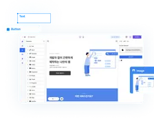
Start by creating simple product mockups that highlight key flows rather than entire, dense interfaces. A common mistake is to drop a full dashboard with tiny text into a laptop frame and hope it does the job. Instead, pick one core workflow that represents your value: for example, “Create an invoice,” “Launch a campaign,” or “Monitor patient vitals.” Use a clean, zoomed-in mockup or a cropped screenshot that focuses on those actions. Tools like Figma or even your website builder’s image settings can help you emphasize just the parts that matter. If you are using a no-code builder, look for blocks that showcase single screens with ample white space rather than galleries of tiny thumbnails.
If your product is interactive or complex, embedding a short demo video or clickable prototype is one of the best investments you can make. Aim for 60–90 seconds that walk through the main use case from a user’s point of view. Do not narrate every feature; instead, tell a mini-story: “Here’s how a finance manager receives, approves, and pays an invoice in under a minute.” You can record a simple screen capture with a voiceover, or link to an interactive prototype hosted on Figma or a similar tool. The goal is to give investors a feel for the customer experience, not to ship your entire onboarding flow. This is especially helpful if you have a complex workflow product that is hard to understand from static images alone.
Every visual should carry its weight. Under each screenshot, mockup, or GIF, include a one-line benefit that explains why it matters: “Automated approvals cut manual processing time by 60%,” “Real-time alerts reduce downtime incidents by 30%,” or “Self-service onboarding reduces support tickets.” Make these benefit lines specific and, where possible, anchored in numbers from pilots or early customers. Statista data, summarized by HubSpot, notes that average online conversion rates are typically under 2% across many e-commerce segments (Statista via HubSpot), which means every element on a page must pull its weight. On an investor-focused product page, visuals that combine “what it looks like” with “why users care” are much more persuasive than pretty UI alone.
A useful test is to scroll through your page while ignoring the main paragraphs, focusing only on headlines, subheads, and visual captions. If an investor could still reconstruct the gist of your product and value from those alone, you are on the right track. If not, tighten your captions, revise your headlines, or remove visuals that do not clearly support the narrative your fundraising pitch depends on.
Building Trust With Traction, Social Proof, and Business Basics
Many early-stage teams underestimate how much they can do to build trust even before they have large revenue numbers. Investors know that not every pre-seed or seed startup will have eye-popping metrics, but they do expect to see evidence that something real is happening. Your investor-ready product page is the perfect place to assemble those signals in a straightforward way.

Start with traction signals that are honest and contextualized. If you have paying users, highlight that in simple terms: “120 paying customers,” “$25k MRR,” or “3 enterprise pilots in progress.” If you are earlier, speak to leading indicators: “3,500 waitlist signups,” “10 design partners,” or “Processed $2M in transactions during private beta.” Always include a short line of context so the investor can interpret the number properly: stating “3 pilots across Fortune 500 hospitals” feels very different from “3 free pilots in small clinics.” Avoid vanity metrics that are hard to verify or tie to your business model. When you are updating this section, treat it the way you would treat your investor update email: concise, precise, and focused on forward momentum.
Social proof helps investors believe that your story extends beyond your team. This might include customer logos, short testimonials, quotes from design partners, or mention of well-known accelerators or grants you have received. For example, the FlipX case study from Outcrowd describes how a startup built a landing page specifically to attract investment for their app development, highlighting early user interest and the backing of local innovation programs to show momentum (FlipX case study). You do not need a wall of logos; a small row of recognizable brands or a couple of concise testimonials can be enough to show that people outside your company see value in what you are building.
Alongside proof points, investors also want to quickly understand the fundamentals of your business. A concise overview of your business model, target market, and team goes a long way. In one short section, explain how you make money (“We operate a subscription model with per-seat pricing, targeting $10–30k ARR per customer”), who your primary ICP is (“US-based mid-market finance teams with 50–500 employees”), and the size or urgency of the problem. Then, introduce your founding team with headshots and one-sentence bios that tie directly to why you are suited to this problem, such as “Former head of AP automation at X,” or “PhD in machine learning, ex–[relevant company].” If you are using a website or landing page builder, resist the urge to bury this in a generic “About” page; instead, include a summarized team section directly on the investor-ready product page.
To see how this plays out in practice, look at breakdowns of YC startup landing pages and investor-friendly websites. Waveup’s analysis notes that strong investor pages often include a compact “By the numbers” section (users, revenue, funding to date) and a “Backed by” block listing accelerators or notable angels (Waveup analysis). You can emulate this pattern on your own product page, even at an early stage, by choosing any honest, forward-moving indicators that reflect your current stage. Over time, you can swap in stronger proof points as your metrics, partners, and team credentials grow.
Technical, UX, and Analytics Checks Before Sharing With Investors
Even if your content is strong, technical glitches or clunky UX can quietly undermine investor confidence. If your forms do not submit, the mobile layout breaks, or pages load slowly, it sends a subtle message about how you run the rest of your company. Before you send a single investor your link, you should run through a short technical and UX checklist.

Begin with basic reliability tests. Open your product page on a laptop, tablet, and phone, ideally using both Wi‑Fi and a slower mobile connection. Scroll through the entire page, click every key link, and submit any forms you expect investors to use, such as “Contact,” “Book a call,” or “Request deck.” Page speed also matters more than many founders realize. Google has found that as page load time increases from 1 to 3 seconds, the probability of a visitor bouncing increases by 32% (Google/SOASTA via Think with Google). If your investor product page takes five seconds to load on mobile, some investors will simply close the tab. Most modern website builders give you at least basic speed scores; treat them as part of your fundraising prep, not an afterthought.
Setting up simple analytics and event tracking is your next layer of preparation. You do not need an advanced data stack to benefit from this. At a minimum, install Google Analytics or a privacy-focused alternative and set up basic goals for key investor actions: visits to your “For investors” section, clicks on “Request deck,” or submissions of contact forms. Over time, this data helps you understand which investor outreach channels lead to actual site engagement and lets you refine your messaging based on what people are reading or ignoring. It also gives you a more professional answer when an investor asks, “How many inbound investor leads have you seen from your website this quarter?” If your builder has built-in analytics, use those for quick checks while still keeping a central analytics tool for consistency.
Finally, pay attention to accessibility, navigation, and readability. Investors will review your site on all kinds of devices and in all kinds of environments, from phone-in-taxi to late-night laptop sessions. Use clear, descriptive navigation labels instead of cute ones; make sure text has strong color contrast against the background; and keep body copy in a readable font size and line length. Aim for headings that explain what sections contain (“Product,” “For investors,” “Traction,” “Team”) rather than vague words like “Discover” or “Explore.” Clean, scannable typography and straightforward navigation make it easier for an investor to find the exact information they are looking for without frustration. This is the same discipline you would apply to any high-stakes landing page or conversion funnel; the only difference here is that the conversion you are chasing is an investor meeting rather than a signup.
Treat these technical and UX checks as part of your fundraising readiness, not as a nice-to-have. An investor-ready product page is not only what you say but how it feels to use, and a polished experience reinforces the story you tell in your pitch meetings.
Your Startup Website Builder Checklist for Investor Ready Product Pages
By this point, you have a clear picture of what an investor wants to see on your product page and how each section should work. To make this repeatable, it helps to consolidate the ideas into a lightweight startup website builder checklist for investor ready product pages that you can reuse every time you update your site or prepare for a new round.

A practical way to do this is to organize your checklist into four groups: messaging, visuals, proof, and technical. Under messaging, include items like “Hero headline states who we serve, what we do, and main outcome,” “Problem–solution narrative is clear and concise,” and “Investor CTA (deck, call, one-pager) is easy to find.” For visuals, check that you have at least one focused product mockup, an optional short demo or prototype link, and benefit-driven captions for each visual. For proof, list traction metrics you are comfortable sharing, social proof elements such as testimonials or logos, and one or two simple “By the numbers” highlights. Under technical, cover mobile responsiveness, page speed checks, working forms, basic analytics, and clear navigation. You can build this checklist directly into your internal docs or even as a reusable template inside your preferred website builder.
Once you have a one-page checklist, schedule regular reviews of your product page, just like you would for your financial model or investor updates. As you grow, your metrics, customer stories, and even your product focus will change. Make a habit of updating headline numbers, refreshing testimonials, and swapping in new visuals when the product evolves. A quarterly review cycle works well for many teams, with an extra, more detailed pass right before you kick off any fundraising process or major investor outreach push. Treat this as part of your standard operating cadence rather than something you only clean up when a big-name fund is about to look at your site.
Finally, align your website checklist with your fundraising plan. For a pre-seed round, your investor product page might lean more heavily on vision, team, and initial validation signals like waitlists or pilots. By Series A, it should reflect clearer revenue metrics, retention data, and the sophistication of your go-to-market motion. Before each new round, use your checklist to define the minimum bar for “investor ready” and assign explicit owners and deadlines for each item. Treat your site not as a static brochure but as a living extension of your pitch that evolves with your company. If you are using an AI website builder or no-code platform, this becomes even easier, because you can rapidly test alternative headlines, layouts, or proof sections without touching code.
When you work this way, your product page becomes a reliable asset instead of a scramble every time an investor asks for your URL. With a focused startup website builder checklist for investor ready product pages, you can approach your next raise knowing that anyone who looks you up will see a clear, credible, and up-to-date story that earns a serious review—and often, a meeting.
Wrapping Up: Turn Your Product Page Into Part of the Pitch
An investor-ready product page does three things well. It explains your product and market in plain language, it backs that story with real signals of progress, and it delivers all of that in a clean, fast, and reliable experience. When those pieces are in place, your website stops being a static brochure and starts working as a quiet, always-on version of your pitch.
The most practical next step is not to rebuild everything from scratch, but to run a focused audit using the four lenses we have covered. Start with messaging by reading your hero section out loud and asking whether a stranger would instantly know who you serve, what you do, and why it matters. Then move to visuals and decide which screenshots or demos actually help an investor “see” the product, trimming anything that is decorative but not informative. Once that feels tighter, review your proof points and team story to check that they reflect where the business is today, not six months ago. Finally, spend half an hour clicking through your site on mobile and desktop, fixing any obvious speed, navigation, or form issues before you send the link to your next investor.
If you are using a no-code or AI website builder, you can make these changes in small, fast iterations rather than in a single big redesign. Tackle one section per week, or block a single afternoon to update copy, visuals, and proof in one pass, and then revisit the page before each new fundraising push. Over time, your checklist becomes part of your operating routine, just like keeping your metrics dashboard or deck current.
You do not need the “perfect” investor page to start getting value from this work. You just need a page that answers the right questions clearly and reflects the real state of your company. If you focus on that, your website will quietly do what you want it to do during a raise: help serious investors understand you faster and make it easier for them to say, “Let’s talk.”
Learn more about No-code insights
Subscribe Waveon Newsletter
*Type your email address